Showing posts with label #amberlabau. Show all posts

Monday, July 31, 2017

School Albums - Part 2: Making a Plan

I'm back with my next step in getting School Albums started. If you are anything like me, you have stacks of school memorabilia in bags or boxes in your closet and just need a system for starting! I did the first post on organizing and photographing artwork in June. Find it here.
Holly | www.paintedladiesjournal.com

Now, we get to the fun part, making a plan for all this stuff. I really like the idea of creating a design that includes everything I want to see in a school year and then repeating it, each year. Today's post included the first page, front and back. I chose to use pocket-style pages. They will be mostly hybrid, but some may be full 12x12 prints of layouts, as well. This all stemmed around the fact that I had been buying an 8x10 school picture and 8x10 class picture each year starting in pre-kindergarten. I really wanted to stick with 12x12 page layouts, and not add in an 8x10 insert for those. I wanted them to be part of the pocket page layouts.

Holly | www.paintedladiesjournal.com

Enter Stage Right: The Fuse Tool. I kept thinking about it and would it be worth it, creating custom pocket pages to make my idea work? I loved the idea too much not to try it. I played around in Photoshop Elements to see what kind of two-sided pocket page would work well and then got to it.
Holly | www.paintedladiesjournal.com

I watched some Youtube videos to get some tips for my first trial with the Fuse. I decided to also invest in the glass cutting mat and a longer metal ruler since I would be working with full 12x12 protectors. (Note: I bought a 12" ruler, but I suggest getting a 15" ruler) I inserted an 8x10 photo into the protector and positioned it where I wanted it, then fused a pocket around it. From there, I continued to complete my pocket page design. (HINT: When printing your other cards, measure the pocket and adjust your card size)


Holly | www.paintedladiesjournal.com

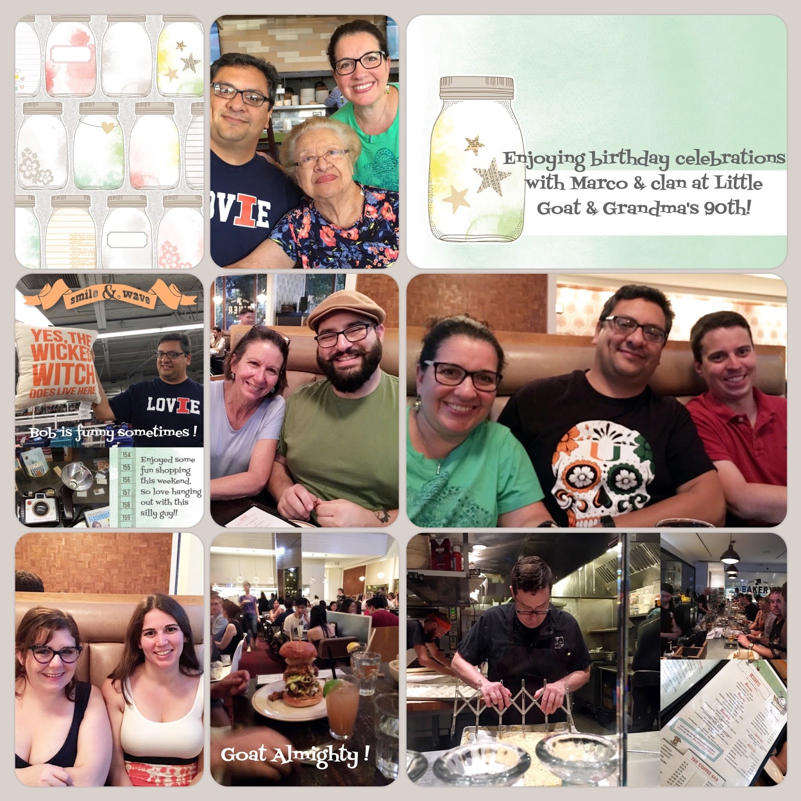
This two-sided page will be my first page each year. Here is the front. It has the 8x10 portrait school photo. I made a little title card to go in the bottom skinny pocket that showcases the grade and teacher's name.

Holly | www.paintedladiesjournal.com


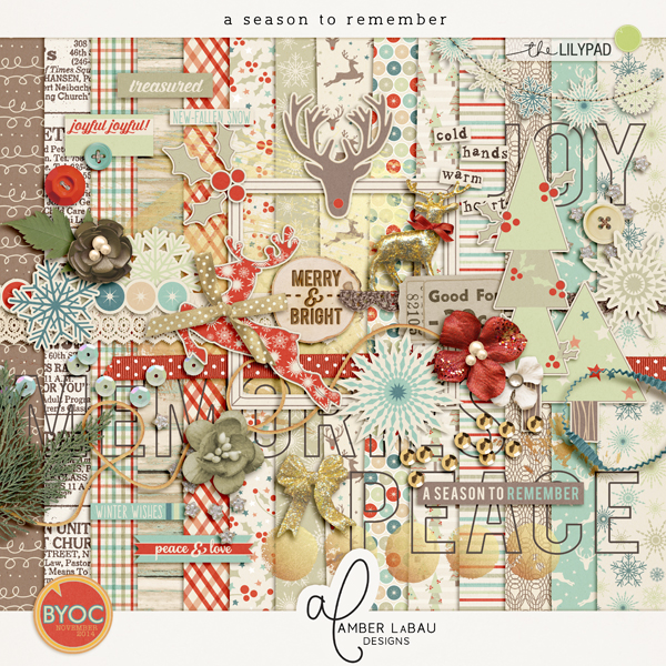
I used a "Wonderful You" paper for a background to put the 2nd Grade title on, which is from "Through the Years." The teacher's name is spelled out with the "Blackboard Alpha". I chose to make a 4x6 card with photos of her two main teachers this school year in the upper pocket, again using "Wonderful You" paper and elements.

Holly | www.paintedladiesjournal.com
The bottom, right pocket is a "Wonderful You" pocket card that had lots of fun info to fill in about the school year.

Holly | www.paintedladiesjournal.com


I had to make a decision to be ok with the back page being read sideways. This type of thing typically bugs me, but I loved the custom pocket page idea so much that I got past this. So, the landscape class photo backs up to the school photo and here, I put in a "first day of school" picture, along with another card from "Wonderful You" that I will have Audrey fill out (now, because she just finished this grade!).

I'm pleased with this set up and plan to repeat it for each year for each child. Hope this gave you some ideas! I will be back soon with more progress on this album set-up. We have to do something with all those photos of school memorabilia that we took.

Here are a few affiliate shopping links to the items I have used in this project. Affiliate links do not cost the buyer anything more and send a few cents to the blog. Thanks!


We R Memory Keepers - Precision Glass Cutting Mat

EK Success - EK Tools - Retractable Knife and Blades

 
15" Metal Ruler (click on picture above)


12x12 3-ring Page Protectors

Monday, July 17, 2017

Setting Yourself Up For a Great Traveler's Notebook

This post is over at the Amber LaBau Designs Blog, here. In this post, I've added a few shopping links incase you see something you have to have! Some are affiliate links. Thanks in advance for your support of our blog.

Holly | www.paintedladiesjournal.com
This is my second Traveler's Notebook that I have put together during/after a family vacation. I took a few "lessons learned" from the first one (which you can find here and here, if you'd like a peak) and incorporated them this time around.

Holly | www.paintedladiesjournal.com

My favorite TN (Traveler's Notebook) Tip that I also used in my first book is the Summary Page. At the beginning of the book, I jot down a few key memories for each day. This book is brought with you for your trip. Do this each evening, before the jam-packed days run into each other in your memory. (of course pictures help, too).

Holly | www.paintedladiesjournal.com
Like my last TN, during my trip, I wrote some journaling of memories I wanted to document. The difference this time around was that I left more space for photos. My first book had all the journaling at the front of the book. That works, too, but I wanted to try spacing it out to add the photos that go with the stories right where they belong.

This trip was last summer, and although ideally this project would be done now, the beauty is that all the journalling already is! I just have to print the photos I want and add them in. I like to add some embellishments, too. Amber LaBau Designs has a great kit called Sun-Kissed that is perfect for all those berry picking outings! I printed mostly blueberry themed items, but it works for all kinds of berry picking. I used my Silhouette to print and cut. I also used PicStitch to create collages of my photos that I could cut apart for my TN pages.

Holly | www.paintedladiesjournal.com


Here are the completed pages that match the previous "before image" of these pages. I chose to print a paper from the Sun-Kissed Kit for my background. I just glued that right onto the left hand side page. 

Holly | www.paintedladiesjournal.com

Here's the next two page spread before I did my crafting. It's beautiful as is, but I wanted to keep with the Sun-Kissed Theme and so I glued down more papers from the kit. This is a Cocoa Daisy Traveler's Notebook that I'm using. If you want plain pages, or know you will paste in lots of your own papers, I like midori brand blank insert refills.  Here is a great Traveler's Notebook Bundle.

Holly | www.paintedladiesjournal.com


And here's the final layout! I printed the pages as 8.5x11 on my Canon PIXMA. I was planning to print those on cardstock, but they printed well on plain paper and from prior experience, I decided I'd like this book to not get too thick. My last book was soooo thick due to lots of cardstock being added. The elements and coordinating Sunkissed Washi Tapes are all printed on cardstock (Canon Matte Photo Paper).

-Holly


Monday, April 17, 2017

How to load and use Styles in PSE

When I started digital scrapping - there were so many things I needed to learn. I was so excited to get started that I didn’t necessarily learn too much before I started on my first few pages. Of course, I had been a paper scrapper for many years and I had been collecting freebies and some basic supplies for a few months before I started. Of course, being the organized person that I am (or at least hope to be..) I wanted to start my digital pages starting in January 2014. Over at Amber LaBau's blog today I am sharing some of my insights in how I was able to improve my scrapping skills by using Styles.
I have been working consistently on Project Life since 2012. As much I love the physical products – I loved the ease of being able to scrapbook on the go because I spend a lot of time commuting/traveling because of work and family commitments. I certainly am able to be much more prolific as a digital scrapper as well (for example I was able to print my second half of 2016 at the end of January).
As a point of reference I am using Photoshop Elements 11. I keep thinking about moving to full Photoshop but I need to better understand how this works offline (since I mostly work offline). The directions will be very similar in full Photoshop.
For me having the photos and kits in “one space” has been life changing in terms of design flexibility – but that of course was only the first step in the design process… There are so many options and tweaks that are possible in digital. I feel like I am still learning something new everyday – I love watching live scraps and working on challenges. There are many challenges available at The Lilypad and you get discount coupons, too! Anything that grows and stretches my design skills is useful – always want to be learning!
One of the first challenges that I had in digital scrapping was learning how to do shadows. Not that I feel like I am an expert yet, but I certainly have come a long way. I look at some of my original layouts and the shadows are super harsh or too large! Here is an example… (please be kind)
A very early digi page, not using styles (kit from Penny Springmann, retired)
From watching some live scraps at Scrap Orchard (which is now closed) I learned about shadow styles – wow!!!! What a difference – plus it provides the consistency that I really, really love... and it also taught me how much how I could learn about digi scrapping.
I love the styles at The Lilypad - the most important and most basic ones are the shadow styles.  Amber has a great set called My Shadow Box
After you purchase and download and unzip, In the Expert panel in PSE- go to the Fx tab on the bottom right.
On the top right of the screen with the 4 lines and the down arrow is where you load styles
Just have your styles (.ASL files) someplace easy to find.  I try to keep them in the same folder in case you need to reinstall (like I am currently in the process of doing :-(...
Now you are all set to start using your new style!
Let me give you an example of the difference that adding styles can make on your page.
Here are the some of Amber's Elements from one of her recent kits - Cake Smash. You will see that these are very cute even without the shadows - but they look much more realistic using the shadows.  Just select the layer the elements is on - and double click the "style" that you want - just hover over the different square and a description will pop up. Literally just 1 click!  You can also select several layers at a time and apply the same style to multiples.
Before
After
In fact here is a recent layout that give you idea how it can all come together
Using Cake Smash by CT Holly
Notice the candle and the flower and how they look like they are popping off the page? Realistic and consistent shadows.  That is what styles can help you achieve easily.  And there are so many options - just take a look around some of your favorite digi stores - The Lilypad is stocked with lots of options.  Many times you need to combine various sets to get the look you really want!
Hope that this have given you a beginning primer on how to install and use styles to get your digi scrapping to the next level! If you have any questions - don't hesitate to reach out - we have lots of experts on our team and many suggestions to help you advance your skills when  you are ready.

Monday, January 23, 2017

How to Stretch your Digi stash

I shared some ideas on Amber La Bau's blog today  on how to stretch your digital kits

Hi there everyone!
I know that even though we all have a large stash of kits in our digital arsenals - I also know that we all like to use our kits several times for creating to maximize our crafting dollars. There are several ways that we can do this - which is one of the biggest benefits for digi scrapping. In fact, this was one of the primary reasons that I switched to digital scrapbooking back in 2014.  I was a dedicated paper scrapper before then, but the ability to stretch my stash (in a non-space taking type way) was one of the most instant benefits of digital scrapping.
So let's look at a few ways that we can stretch our stash and our digi kit dollars.
  • Use Neutral colored kits to be able to document lots of everyday memories or even bigger stories. Use key elements of your photos or background to pick a primary color - then shop your stash to find a similar predominant color in the kit.
    Stories to Tell kit
    Stories to Tell kit  - neutral colors and elements. Word art can be used for many different kinds of stories.
    Have Coordinates Will Cache - although this is an outdoor kit - there are lots of great neutral papers and elements to use with any kind of photo.
    Have Coordinates Will Cache - although this is an outdoor kit - there are lots of great neutral papers and elements to use with any kind of photo.
  • The Blackbird kit has lots of great neutrals and bold neutral patterns that can be used for many different kinds of stories.
  • Use flexible templates that can be combined and modified.  These templates can be used for patterned papers, photos or even artsy treatments.
    This example reduces the template and then mats with a large border and highlights some of the great patterned paper
    This example reduces the template and then mats with a large border and highlights some of the great patterned paper
    Story Grids Anthology Vol. 2
    Story Grids Anthology Vol. 2

  • Use "themed" kits off theme.  Not every kit needs to be used for the theme that it was initially designed for.  For example, I used this Christmas/Winter kit, A Season to Remember to document some travel photos from our trip to Spain.
    Use a Season to Remember to document some vacation photos.
    Use a Season to Remember to document some vacation photos.
    A Season to Remember
    A Season to Remember
    I hope this gives you some ideas on how to use your kits again and extend your stash even further.  Have fun documenting your memories!                                        

Friday, September 23, 2016

Project Life App roundup

I've been doing lots of catching up on my  Project Life for 2016 in the last week since Becky Higgins had a sale on her kits in the Project Life app. Don't know about the app, here is some additional
info on Becky's website. 

The app is the handheld version of Becky's Project Life memory keeping system. You can make it as complicated or as simple as you like. Daily, weekly, monthly or event scrapping. Whatever is the most important for you to document- this system can help you- and you can include lots of pictures or stories. 

I think part of the reason I've been so inspired is that I really took a look at some of the kits again with a fresh set of eyes. When the app updates come out- I somehow convince myself that I don't need that kit ... However at $.99, they were much easier to buy even for just a few cards that I love within a kit. 

I am nearly a 100% Digi scrapper so I already use lots of tools to make using the PL App easier. I use Dropbox and lots of phone editing tools on my phone and editing tools on my laptop/ computer. I even got an Eye-Fi card recently ( I am still learning about this great tool to allow DSLR photos transferred directly on your phone or computer) to make my process easier. 

I am fortunate to be on a few CT teams so I try to use photos that I want to scrap as part of my assignments, but that still leaves me with lots of photos and gaps in my documenting. I am not sweating a weekly format, but pretty much I end up with nearly a page or 2 a week.  

So back to my new love of the app. The most recent update allows you to directly edit your photos in PicTapGo, an app by RadLab. It has been LIFE CHANGING - I know it seems an extreme statement but I love the ease of not having to move in and out of the app to edit photos. Plus my biggest pet peeve is photos that are
croocked. You can fix that in PicTapGo too!! Wow!! Now you really can complete a page while riding in a taxi or waiting at the airport. ( and even finish a blog post!)

So let me get started on sharing some of my recent goodies. 

I often look at the primary photos I want to document and I pick a page protector from that. If I have few more pictures to include I use the collage function in the PL App to create a collage for one of the pockets. Her Design A and Project 52 2016 Edition by Amber LeBau with the Project 52 overlays. 

 Here is used Design A again but with a collage in the bottom left. To document our Scrapbook Expo day! Card kit is Currently edition by One Little Bird. 


I actually went out on a limb and combined 2 kits with another Design A, ha! Inspire has the beautiful watercolors and Everyday edition by Liz Tamanaha has great black and white cards! I used Phonto to add the curved text and the title with a white background for the title. 


Went back to an oldie but goodie using Cobalt edition cards and a photo collage. I used Photo here ( but you can use Rhona Designs and several others) to add text to your photos. One trick I use when the photo is too busy for my text to stand out is to use a very transparent grey box behind the text. All done in Phonto. 


Love this page using Design U with the doors of San de Allende, a beautiful colonial town near Mexico City. I used just one card from the DIY Shop value kit and some great elements from Rhona Designs to add just the right touch to this page.  So many great photos and I was able to tell the story of our trips on other pages so this one really just needed photos!


Here to document pages from my sons graduation I used Capture Life kit and Squared Away 13 template. This kit has some great square card options which not all kits do. However one trick I learned is starting with a standard size,  say Design A for example or using a larger spot on your current template, and then you can then move a 4x6 or 3x4 card to that slot. 
I also really liked how I was able to use my panoramic photo on both photo slots on the bottom of this template. 


The newest app update has blank solid colored cards which match each kit. There are so many possibilities! You can use it to add additional journaling right in the PL App or Phonto or Rhonna Designs if you have a different font that you want to use. One of my favorite things that I have done as a scrapper is to have my handwriting turned into a font. It's a great way to document yourself in a lasting way- especially when you are a Digi scrapper!

Another great option for these blank cards is as a base for all the cool graphics and word art that are available in apps like Over and LetterGlow. I love some of the options out there. Why not take advantage of all the great designs out there by professional graphic designers to add a little sumpthing sumpthing to finish off your page. 


I'll close this post up with a few more PL app page goodies to share! Hope you all have a great weekend - take lots of pics so that you can scrap them on your Phone!